
Small Business Signage Tips That Attract Customers
Source:https://blogadmin.vpsvc.com
In 2021, I worked with a specialty bakery that was on the verge of bankruptcy. They were located on a busy street with over 15,000 cars driving by daily, yet their foot traffic was dangerously low. When I drove out to meet the owner, I missed the building twice.
The problem was immediately obvious: their storefront sign featured an elegant, cursive script painted in pale gold against a white background. It was completely illegible from more than 10 feet away. We replaced it with a high-contrast, backlit channel letter sign. Sales increased by 42% in the first month without spending a single dime on digital marketing.
Over my 10 years of auditing retail spaces, I have learned that your physical sign is the hardest-working employee you have. It works 24/7, never calls in sick, and serves as the primary anchor for your local brand visibility.
Think of your physical storefront sign like a dating app profile picture for your business. If it is blurry, confusing, or blends into the background, potential customers will swipe left—keeping their foot on the gas pedal—before they ever discover how amazing your product is inside.
The Science of Curb Appeal: Foundational Small Business Signage Tips
Most new business owners treat their exterior signage as an afterthought, selecting materials and fonts based purely on aesthetic preference. This is a fatal operational mistake. Effective small business signage tips are rooted in the science of human optics and visual hierarchy, not just graphic design.
When a driver or pedestrian approaches your location, you have exactly three seconds to communicate who you are and what you sell. If your sign requires them to squint, decipher complex logos, or read a paragraph of text, you have already lost the sale.
Mastering the Contrast Ratio and Negative Space
The single most common mistake I see on retail storefronts is a lack of contrast. If you put dark lettering on a dark background, or light lettering on a light background, the text bleeds together in the sunlight.
-
Maximize Contrast Ratio: The highest visibility color combinations are black on yellow, black on white, and yellow on black. If your brand colors are muted pastels, you must use a dark, high-contrast outline around your lettering to make it pop.
-
Embrace Negative Space: Do not cram every inch of your sign with phone numbers, website URLs, and slogans. Aim for at least 40% negative space (empty background). This gives the primary text room to breathe and makes it readable at high speeds.
-
The 1-to-10 Rule of Scale: For every 10 feet of distance between your sign and your target customer, your letters must be at least one inch tall. If the street is 100 feet away, your letters absolutely must be a minimum of 10 inches high.
Choosing the Right Format: A Structural Comparison
Different locations require different signage architectures. Applying the right format to your specific line of sight is critical for capturing foot traffic.
| Signage Type | Best Use Case | Visibility Impact | Estimated Cost Tier |
| Channel Letters | Strip malls and standalone buildings | Extremely high; 3D letters can be individually illuminated (halo-lit or front-lit). | High |
| Blade Signs | Dense urban sidewalks | High for pedestrians; mounts perpendicular to the building to catch lateral foot traffic. | Medium |
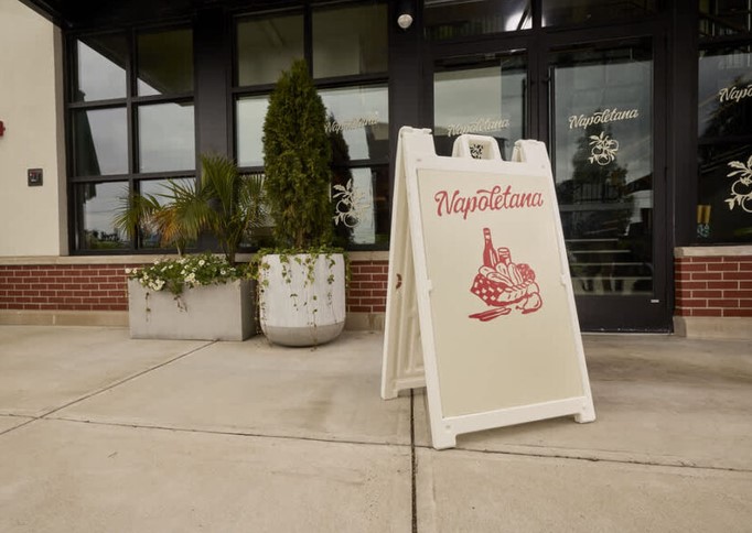
| A-Frame (Sandwich) | Sidewalks outside cafes or boutiques | Excellent for daily specials; interrupts the pedestrian’s physical path. | Low |
| Window Graphics | Service businesses (salons, gyms) | Good for utilizing existing real estate; creates privacy while advertising. | Low |
Advanced Small Business Signage Tips for Competitive Markets
If you are operating in a dense retail environment where dozens of businesses are fighting for attention, a standard flat board will not cut it. You must optimize for both daytime legibility and nighttime prominence.
Illumination and Material Selection
Relying on streetlights to illuminate your storefront is a recipe for invisibility after 5:00 PM. Illuminated signs are non-negotiable for restaurants, bars, and convenience stores.
LED technology has made backlit signage incredibly energy-efficient. Consider “halo-lit” letters, where the light shines behind the text, creating a premium, modern silhouette against your building’s facade. Furthermore, always insist on UV-resistant materials. Cheap vinyl or un-treated plastics will fade and crack within two summers, instantly degrading your brand’s perceived value.
Navigating Local Zoning Laws
Before you fall in love with a massive, neon-flashing design, you must consult your local city planner. Zoning laws are ruthless, and municipalities will force you to tear down a non-compliant sign at your own expense.
Always check the local ordinances regarding maximum square footage, right-of-way overhang limits, and illumination curfews. Many historic districts completely ban internally illuminated signs, requiring you to use external gooseneck lighting instead. Securing a permit before manufacturing begins is the most cost-saving signage tip I can offer.
Expert Advice: Pro-Tips & Hidden Traps
Pro-Tip: Optimize for the “Secondary Line of Sight.” Don’t just look straight at your building from the parking lot. Walk a block down the street in both directions. If a massive oak tree or a neighboring building blocks your primary sign from the main intersection, you need to install a perpendicular blade sign or an A-frame on the sidewalk to capture that lateral traffic.
Beware of the “Typography Trap.” It is incredibly tempting to use complex, stylized script fonts because they look “classy” on a computer screen. However, script fonts are notoriously difficult to read from a moving vehicle. Save your fancy fonts for your business cards and menus. For your primary exterior signage, stick to bold, sans-serif typography with excellent kerning (letter spacing).
Transforming Your Storefront into a Sales Engine
Mastering these small business signage tips is about taking control of your local physical real estate.
When you prioritize legibility, high contrast, and strategic placement over cluttered design, you eliminate friction for your customers. A well-designed sign acts as a silent, relentless salesperson that justifies your premium prices and pulls local traffic straight through your front door.
What’s Your Take?
Step outside your business tomorrow at noon and look at your sign from across the street. Is it truly readable, or is it blending into the brickwork? What is the biggest signage or zoning challenge you are currently facing in your city? Drop your thoughts, questions, or storefront experiences in the comments below—I’d love to help you troubleshoot!